Editing/Graphic Design
Howdy folks!
This post marks the fifth devlog documenting the process of developing my first ever game Flame In The Abyss!
Welcome to Chapter 5 of the #SparkInTheDark Journal: Editing/Graphic Design!
Truth be told, a lot of editing for me tends to happen pretty quickly all things considered. Once I feel confident in what I want to say, finding the right way to say it becomes infinitely easier to do.
That being said, the edits for the final draft of the game actually had quite a few adjustments happen that were not just to the plain text. My partner Moss is also my main graphic design partner and often brings tremendous insight when it comes to layout for games & playbooks. Because of this, we actually discovered a lot more places where brevity was needed in the text in order to make the layout cleaner and easier to read. Editing as a result became an interplay between graphic design and writing revisions, informing one another in how both the plain text and final layout documents would look.
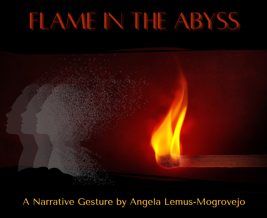
All of the assets, including figures, images, and color palette, were done through free resources available on Canva.
I love Canva & I'm glad to have gotten my start designing with it. I am not a visual artist but Canva has made me way more confident working in visual mediums.
After a few revisions in the plain text and figuring out the right kind of consistent language to use throughout, the last steps for design were about making the game have a cohesive vision.
Labeling sections, choosing images, and even what text went where came down to wanting to evoke fire. Going from a spark to a fire gently fading out felt like the perfect image to encapsulate the intended player journey: bright and intense to calm and released of emotion.
This game was never about letting the cold of grief hurt you nor was it about stewing with loss to the point of burning fury. You hold trauma gently, like a warm stone, then cast it off into the sea when ready. And so, the warm color palettes mixed with muted, shadowy tones were chosen as a way to best illustrate all those layers.
After many months of working on this project, the game was done.
So, what next?
Get Flame In The Abyss
Flame In The Abyss
A GM-less journey into memories, grief, and recovery.
| Status | In development |
| Category | Physical game |
| Author | Voice of the Phoenix |
| Tags | GM-Less, grief, Itch Funding, memories, Music, poc-made, recovery, Tabletop role-playing game |
More posts
- PromotionApr 05, 2022
- PlaytestingApr 05, 2022
- Outlines/First DraftApr 05, 2022
- ResearchApr 05, 2022
- BeginningsApr 05, 2022

Leave a comment
Log in with itch.io to leave a comment.